Custom Patio Cover Color Schemes That Complement Your Home
Table of Contents
1. Introduction
2. Understanding Color Psychology in Outdoor Spaces
3. Classic Color Schemes That Never Go Out of Style
4. Bold and Modern Color Combinations
5. Natural and Earth-Tone Palettes
6. How to Match Your Patio Cover to Your Home’s Architecture
7. Seasonal Color Considerations
8. Popular Color Trends for 2024
9. Tips for Testing Colors Before Committing
10. Maintenance Considerations for Different Colors
11. Conclusion
12. Frequently Asked Questions
Introduction
Your patio cover isn’t just a functional addition to your outdoor space—it’s a design statement that can make or break your home’s curb appeal. The color scheme you choose for your custom patio cover plays a crucial role in creating a cohesive look that enhances your property’s overall aesthetic appeal. Whether you’re planning a brand-new installation or considering a refresh of your existing cover, selecting the right colors can transform your outdoor living area into a stunning extension of your home.
The beauty of custom patio covers lies in their versatility. Unlike off-the-shelf options, custom covers allow you to explore endless color possibilities that perfectly complement your home’s unique character. From subtle neutrals that blend seamlessly with your existing architecture to bold statement colors that create dramatic focal points, the right color scheme can increase your property value while creating an inviting space for relaxation and entertainment.
Understanding Color Psychology in Outdoor Spaces
Color psychology plays a significant role in how we perceive and feel in our outdoor spaces. When selecting colors for your patio cover, it’s important to consider not only visual appeal but also the emotional impact these colors will have on you and your guests.
Warm colors like reds, oranges, and yellows create energy and excitement, making them perfect for entertaining areas. These hues can make your patio feel more intimate and cozy, especially during evening gatherings. However, in extremely hot climates, these colors might feel overwhelming during peak summer months.
Cool colors such as blues, greens, and purples promote relaxation and tranquility. They’re excellent choices for creating a peaceful retreat where you can unwind after a long day. These colors also tend to make spaces feel larger and more open, which is particularly beneficial for smaller patios.
Neutral colors offer the most versatility and longevity. Grays, beiges, and whites provide a sophisticated backdrop that won’t compete with your landscaping or outdoor furniture. They also offer the flexibility to change your decor seasonally without clashing with your patio cover.
Classic Color Schemes That Never Go Out of Style
Some color combinations have stood the test of time for good reason. These classic schemes work beautifully with various architectural styles and continue to look fresh year after year.
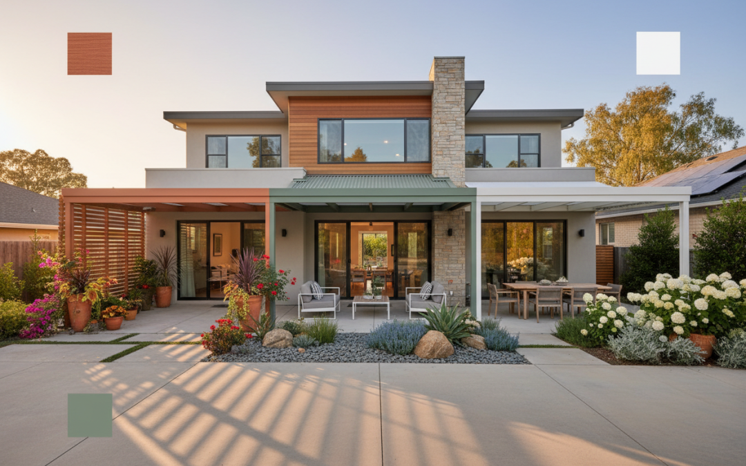
The timeless white and gray combination remains one of the most popular choices for patio covers. This pairing offers crisp, clean lines that complement both traditional and contemporary homes. White provides brightness and makes spaces feel larger, while gray adds sophistication and depth. This combination works particularly well with homes featuring stone, brick, or stucco exteriors.
Navy blue and white create a nautical-inspired look that’s both classic and refreshing. This combination works exceptionally well for coastal homes or properties with blue accents in their exterior color scheme. The deep blue provides a rich contrast against white trim while maintaining a sense of elegance and calm.
Cream and brown offer a warm, inviting palette that complements natural materials beautifully. This earth-inspired combination works well with wooden elements, natural stone, and traditional architectural styles. The warmth of these colors creates a cozy atmosphere while maintaining a sophisticated appearance.
Bold and Modern Color Combinations
For homeowners who want to make a statement, bold color combinations can create stunning focal points that showcase personal style and contemporary design sensibilities.
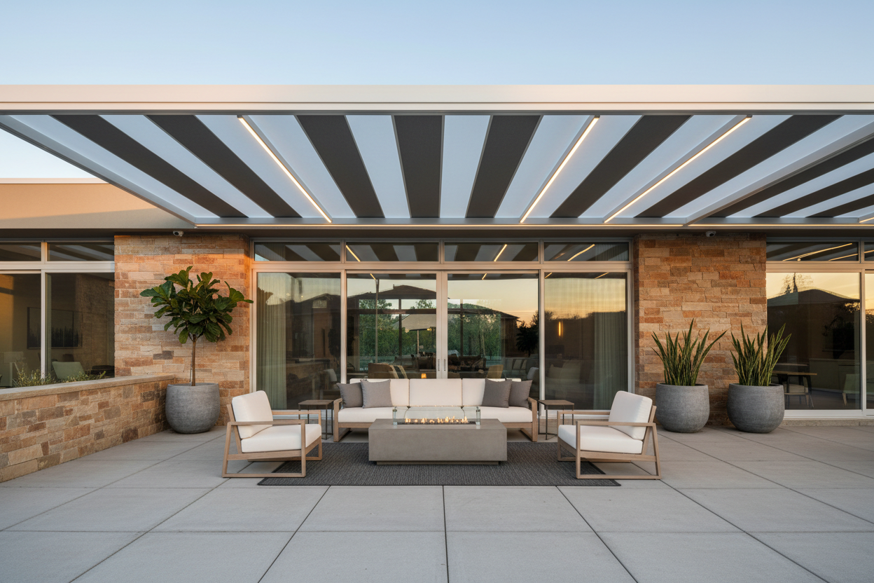
Charcoal and bright white create a striking contrast that’s perfect for modern and minimalist homes. This high-contrast combination emphasizes clean lines and geometric shapes, making it ideal for contemporary architecture. The dramatic difference between these colors adds visual interest without being overwhelming.
Deep green paired with natural wood tones creates a sophisticated, organic feel that connects your outdoor space with the surrounding landscape. This combination works particularly well in wooded settings or for homes with extensive landscaping. The green blends with natural foliage while the wood tones add warmth and texture.
Burgundy and cream offer a rich, luxurious palette that’s perfect for creating an upscale outdoor living area. This combination works beautifully with brick homes or properties featuring warm-toned exterior materials. The deep burgundy adds drama while the cream softens the overall look and prevents it from becoming too intense.
Natural and Earth-Tone Palettes
Earth-tone color schemes create harmonious outdoor spaces that feel like natural extensions of the landscape. These palettes work particularly well for homes in natural settings or for homeowners who prefer organic, understated elegance.
Sage green and sandstone create a calming, nature-inspired palette that blends beautifully with most landscaping. This combination is particularly effective for homes with natural stone or stucco exteriors. The soft green connects with plant life while the warm sandstone adds stability and grounding to the overall design.
Terracotta and cream evoke Mediterranean and Southwestern styles, creating warm, inviting outdoor spaces. This combination works exceptionally well with adobe, stucco, or tile-roofed homes. The earthy terracotta adds richness and character while the cream provides balance and prevents the space from feeling too heavy.
Warm gray and natural wood tones offer a contemporary take on earth-tone palettes. This combination provides the sophistication of modern design while maintaining the warmth and organic feel of natural materials. It’s particularly effective for transitional and contemporary home styles.
How to Match Your Patio Cover to Your Home’s Architecture
Your home’s architectural style should heavily influence your patio cover color selection. Different architectural styles have traditional color palettes that enhance their inherent character and charm.
Traditional homes, including Colonial, Victorian, and Craftsman styles, typically look best with classic color combinations. White, cream, and soft gray patio covers complement these styles beautifully. For Craftsman homes specifically, consider earth tones like sage green or warm brown that echo the natural materials often used in this architectural style.
Modern and contemporary homes offer more flexibility for bold color choices. Clean lines and minimalist design elements can handle high-contrast combinations like black and white or charcoal and bright accents. These homes often feature large windows and open floor plans, so your patio cover color should complement these expansive, airy qualities.
Mediterranean and Spanish-style homes pair beautifully with warm, earthy tones. Terracotta, warm beige, and deep gold colors enhance the romantic, Old-World charm of these architectural styles. Consider incorporating wrought iron accents or decorative elements that echo the ornate details often found in Mediterranean design.
Seasonal Color Considerations
While your patio cover will be a permanent fixture, considering how different colors look throughout the seasons can help you make a choice you’ll love year-round.
Spring and summer favor lighter, brighter colors that reflect heat and create cool, comfortable outdoor spaces. Light grays, whites, and soft blues work particularly well during warmer months. These colors also provide beautiful backdrops for colorful flowers and lush green foliage.
Fall and winter can make darker colors appear richer and more inviting. Deep blues, forest greens, and warm browns create cozy atmospheres during cooler months. However, remember that darker colors may make spaces feel smaller and can absorb more heat during summer months.
Consider your primary usage patterns when selecting colors. If you primarily use your patio during summer months, lighter colors might be more practical. If you’re a year-round outdoor enthusiast, neutral colors that work well in all seasons might be your best bet.
Popular Color Trends for 2024
Current design trends are embracing both bold statements and serene, nature-inspired palettes. Understanding these trends can help you create a contemporary look that will remain stylish for years to come.
Warm minimalism is trending strongly, featuring soft, muted colors that create calm, uncluttered spaces. Think warm grays, soft beiges, and muted greens that promote relaxation while maintaining sophisticated appeal. These colors work beautifully with natural materials and simple, clean lines.
Biophilic design continues to gain popularity, emphasizing connections with nature through color choices. Deep forest greens, ocean blues, and earth browns create outdoor spaces that feel like natural retreats. These colors work particularly well when combined with natural materials like wood and stone.
Dramatic contrasts are also having a moment, with homeowners choosing bold color combinations that make strong design statements. Black and white, navy and cream, and charcoal and natural wood are popular choices for those wanting contemporary, high-impact designs.
Tips for Testing Colors Before Committing
Selecting the perfect color scheme requires careful consideration and testing. Colors can look dramatically different under various lighting conditions and against different backgrounds.
Start by collecting samples of your preferred colors and observing them at different times of day. Morning light, midday sun, and evening shadows can all affect how colors appear. Place samples against your home’s exterior walls to see how they interact with existing colors and materials.
Consider creating a mood board that includes your potential patio cover colors alongside photos of your home, existing outdoor furniture, and landscaping. This visual tool can help you see how all elements work together before making final decisions.
Many manufacturers offer digital visualization tools or can provide large color samples. Take advantage of these resources to get a better sense of how your chosen colors will look in your specific setting. Don’t rely solely on small color chips, as they rarely give an accurate representation of how colors will appear on large surfaces.
Maintenance Considerations for Different Colors
Different colors require varying levels of maintenance to keep them looking their best. Understanding these requirements can help you make practical choices that align with your lifestyle and maintenance preferences.
Light colors, particularly whites and creams, tend to show dirt, pollen, and weather stains more readily than darker colors. However, they also reflect heat better and can help keep your outdoor space cooler. Regular cleaning is essential to maintain their fresh appearance.
Dark colors hide dirt and stains better but may fade more quickly in intense sunlight. They also absorb more heat, which can make your patio uncomfortably warm during peak summer hours. High-quality, UV-resistant finishes are crucial for maintaining dark colors over time.
Medium-toned colors often offer the best balance between practicality and aesthetics. Grays, sage greens, and warm beiges hide minor imperfections while still looking fresh and clean. They typically require less frequent cleaning than light colors while avoiding the heat absorption issues of very dark colors.
Conclusion
Choosing the perfect color scheme for your custom patio cover is an exciting opportunity to enhance your home’s beauty and create an outdoor space that truly reflects your personal style. Whether you prefer timeless classics, bold modern statements, or nature-inspired earth tones, the key is selecting colors that complement your home’s architecture while creating the atmosphere you desire.
Remember that your patio cover is a long-term investment, so take time to consider how your chosen colors will look throughout different seasons and lighting conditions. Test your options thoroughly, consider maintenance requirements, and don’t be afraid to consult with design professionals who can help you visualize your options.
The right color scheme will transform your patio cover from a simple functional element into a beautiful design feature that enhances your property value and provides years of enjoyment. With careful planning and consideration, you can create an outdoor space that seamlessly blends with your home while expressing your unique style and personality.
Frequently Asked Questions
What are the most popular patio cover colors?
The most popular patio cover colors include white, various shades of gray, beige, and cream. These neutral colors offer versatility and complement most home styles and landscaping. They also tend to reflect heat well and provide timeless appeal that won’t go out of style.
Should my patio cover match my house exactly?
Your patio cover doesn’t need to match your house exactly, but it should complement your home’s overall color scheme and architectural style. Consider using colors that are either similar to your home’s existing palette or that provide pleasing contrast while maintaining visual harmony.
Do dark-colored patio covers get hotter than light ones?
Yes, dark-colored patio covers absorb more heat than light-colored ones, which can make the area underneath warmer. If you live in a hot climate and plan to use your patio during peak sun hours, lighter colors are generally more comfortable choices.
How do I choose colors that won’t look dated in a few years?
Stick with classic, neutral color schemes for longevity. Colors like white, gray, beige, and cream have remained popular for decades. If you want to incorporate trendy colors, consider using them in easily changeable elements like cushions, planters, or decorative accents rather than the patio cover itself.
Can I paint my existing patio cover a different color?
In most cases, yes, you can paint an existing patio cover. However, the success depends on the current material and finish. Consult with a professional to determine the best preparation methods and paint types for your specific patio cover material to ensure long-lasting results.
What colors work best with brick homes?
Brick homes pair beautifully with neutral colors like cream, white, and warm gray. These colors complement the natural warmth of brick without competing with its texture and color variations. Avoid colors that clash with the brick’s undertones—for example, cool grays might not work well with warm, red-toned brick.

Rockwall TX custom patio cover cost | Keathley Landscaping

Dallas TX custom wood pergola | Keathley Landscaping

Mobile City TX outdoor living contractor | Keathley Landscaping

Frisco TX custom wood pergola | Keathley Landscaping

Highland Park TX custom pergolas | Keathley Landscaping

Dallas TX covered patios | Keathley Landscaping

Lake Highlands Dallas TX outdoor living contractor | Keathley Landscaping

Lakewood Dallas TX custom wood pergola | Keathley Landscaping

Highland Park TX custom patio covers | Keathley Landscaping

Garland TX covered patios | Keathley Landscaping

Frisco TX custom patio cover cost | Keathley Landscaping

Lucas TX custom patio covers | Keathley Landscaping

Preston Hollow Dallas TX custom patio covers | Keathley Landscaping

Rockwall TX pergola builders | Keathley Landscaping

Sachse TX outdoor living contractor | Keathley Landscaping

Fairview TX luxury custom pergolas | Keathley Landscaping

Murphy TX covered patio contractors near me | Keathley Landscaping

Frisco TX custom pergolas | Keathley Landscaping

Allen TX outdoor living contractor | Keathley Landscaping

Dallas TX pergola companies near me | Keathley Landscaping

Sachse TX custom pergolas | Keathley Landscaping

Preston Hollow Dallas TX covered patios | Keathley Landscaping

McKinney TX pergolas | Keathley Landscaping

Fairview TX pergola builders | Keathley Landscaping

Lavon TX custom patio covers | Keathley Landscaping

Plano TX custom patio cover cost | Keathley Landscaping

Plano TX luxury custom pergolas | Keathley Landscaping

Fate TX custom patio covers | Keathley Landscaping

residential sod installation Parker Texas

grass installation Dallas Texas

sod installation company Garland Texas

installation of sod cost Lowry Crossing Texas

sod contractors Dallas Texas

sod company Lavon Texas

sod installation near me Lowry Crossing Texas

price of sod installation Parker Texas

sod installation near me Frisco Texas

sod grass installation Frisco Texas

installation of sod cost Richardson Texas

grass installation Rowlett Texas

cost of sod and installation Allen Texas

grass contractor Murphy Texas

sod installation near me Murphy Texas

cost for sod installation Lucas Texas

sod installation companies Rockwall Texas

sod contractors Richardson Texas

residential sod installation Rose Hill Texas

new sod installation Wylie Texas

sod installation companies Frisco Texas

new sod installation McKinney Texas

lawn sod installation Plano Texas

sod contractors Mobile City Texas

cost for sod installation McKinney Texas

lawn sod installation McKinney Texas

sod installation company near me Wylie Texas

price of sod installation Lake Highlands Dallas Texas

drain contractor Garland Texas

outdoor drain repair Mobile City Texas

drainage contractors near me Fate Texas

yard drainage Dallas Texas

yard drainage Rose Hill Texas

drainage Sachse Texas

drainage Allen Texas

drainage company Rose Hill Texas

drainage company Garland Texas

drain cleaning Wylie Texas

drainage company near me Richardson Texas

drainage solutions near me Lucas Texas

drainage company near me Lavon Texas

landscape drain Frisco Texas

drainage contractors near me Lakewood Dallas Texas

drain cleaning Parker Texas

drainage solutions near me Allen Texas

drainage company near me Parker Texas

drainage company near me Highland Park Texas

landscape drainage contractor near me Fate Texas

drain contractor Frisco Texas

landscape drainage contractor near me Garland Texas

yard drainage Sachse Texas

channel drain cleaning McKinney Texas

landscape drainage contractor near me Rockwall Texas

yard drainage contractors near me Sachse Texas

outdoor drain repair Frisco Texas

Recent Comments